
Matrix
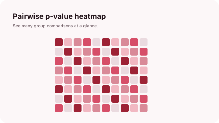
Heatmap
Scan many pairwise p-values with color.
AutoDunn turns group comparisons into simple visual views.
Scan many pairwise p-values with color.
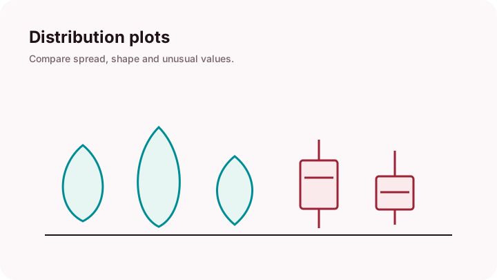
See spread, typical values, and outliers.
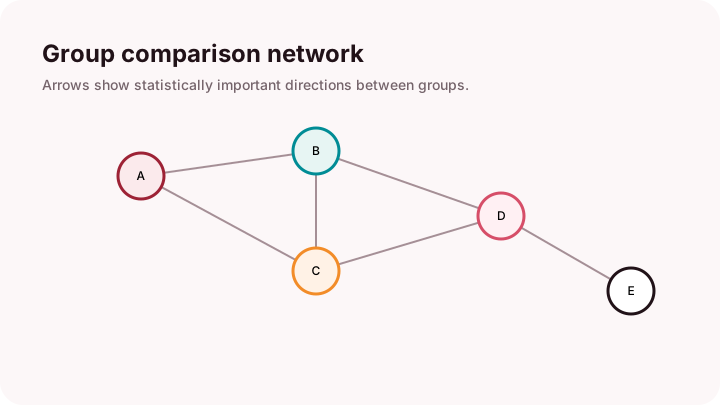
Circles are groups; arrows show significant pairs.
Curved lines connect groups that differ.
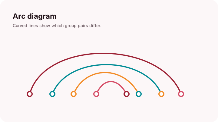
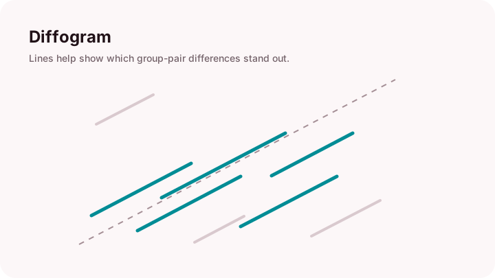
Lines show which group pairs stand out.

Save selected visuals for later use.
Site illustrations are original.
Start broad, then look closer.
Use the heatmap to spot strong differences.
Check how values spread within groups.
Use networks and arcs for the bigger pattern.